Insight
A merger of two influential companies in data analytics presented an opportunity to set the tone for an industry.
The data science and analytics sector is crowded with similar products and services, with well known brand names like IBM Watson, Amazon Web Services and Microsoft Azure.
Cloudera is a relatively small player in data infrastructure, and outside of the data analytics industry, Cloudera has little, if any, brand awareness. With their merger with HortonWorks, this presented an opportunity for Cloudera to compete head to head with the better known brands in data analytics.
Last year, we were approached by the marketing team at Cloudera to reimagine their design system for all marketing channels, including digital and environments.
What we did
- _ Identity
- _ Brand system
- _ Typeface design
- _ Motion graphics
- _ Photography
- _ Voice

Outcome
A soulful approach to data science.
Most brands in data analytics take a very unemotional approach to their marketing. They treat what they do like a utility. We think that’s a missed opportunity. Cloudera believes that the greatest breakthroughs of the next century will take place because of the power of data science, which gives them permission to take a more exciting stance in the marketplace.
Identity
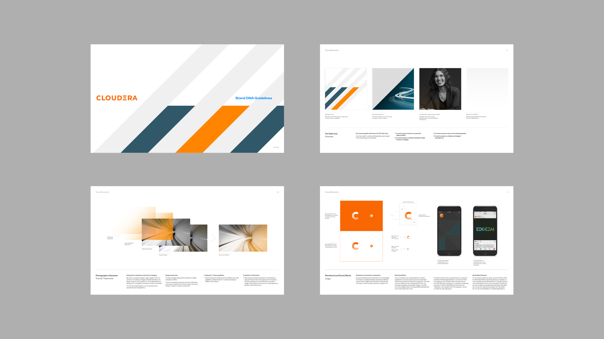
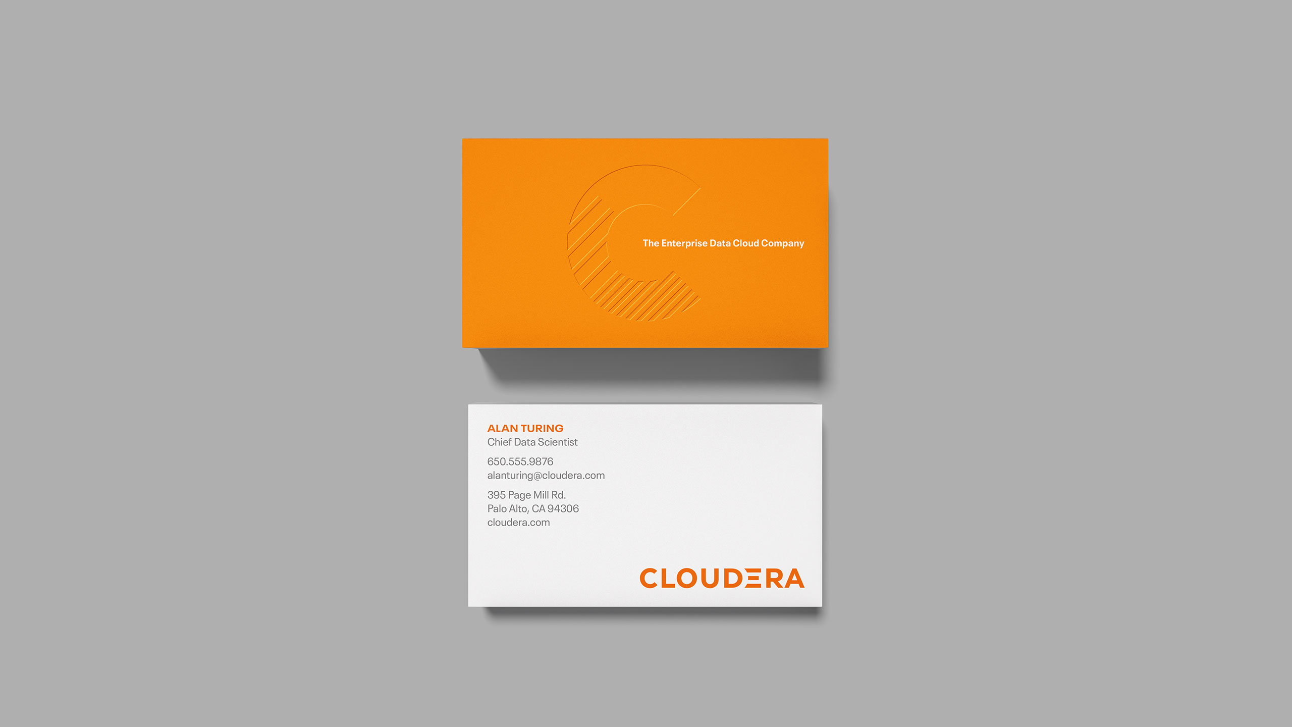
We developed a new logotype for Cloudera that has been carefully crafted for legibility at a variety of sizes, and has a bold, striking design which reflects their confidence as a leader in cloud computing and data science.
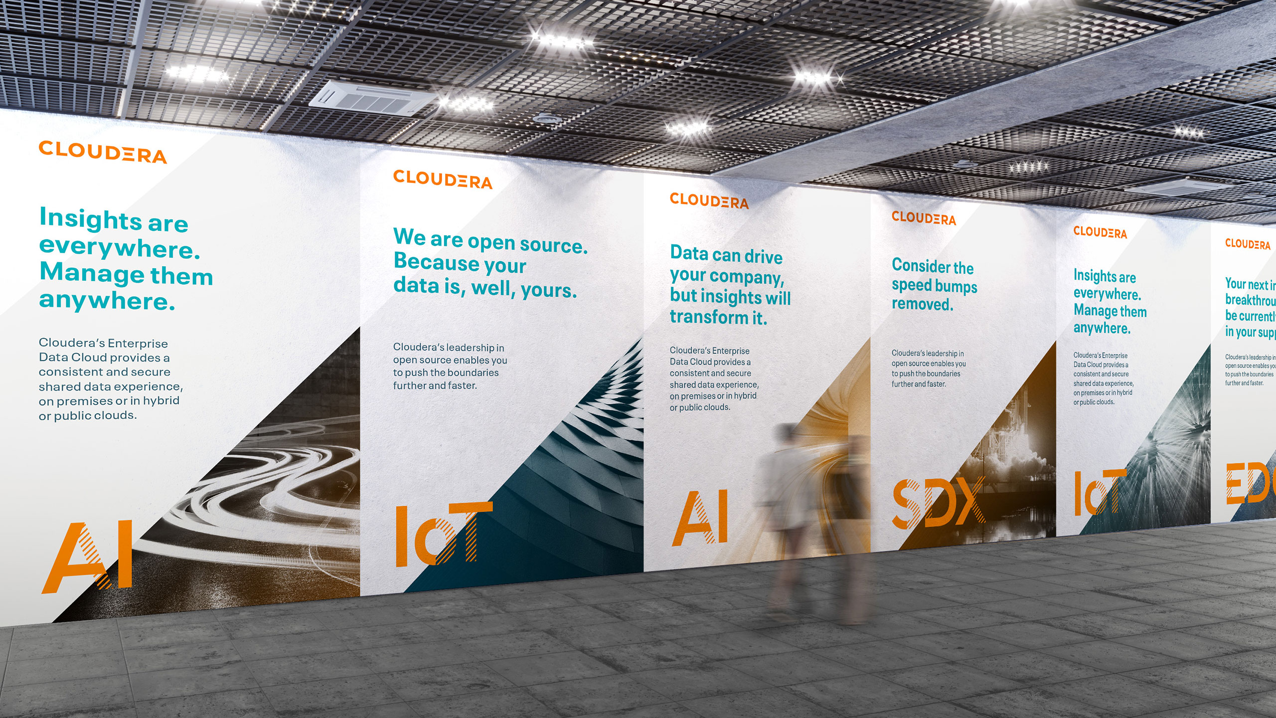
Brand System
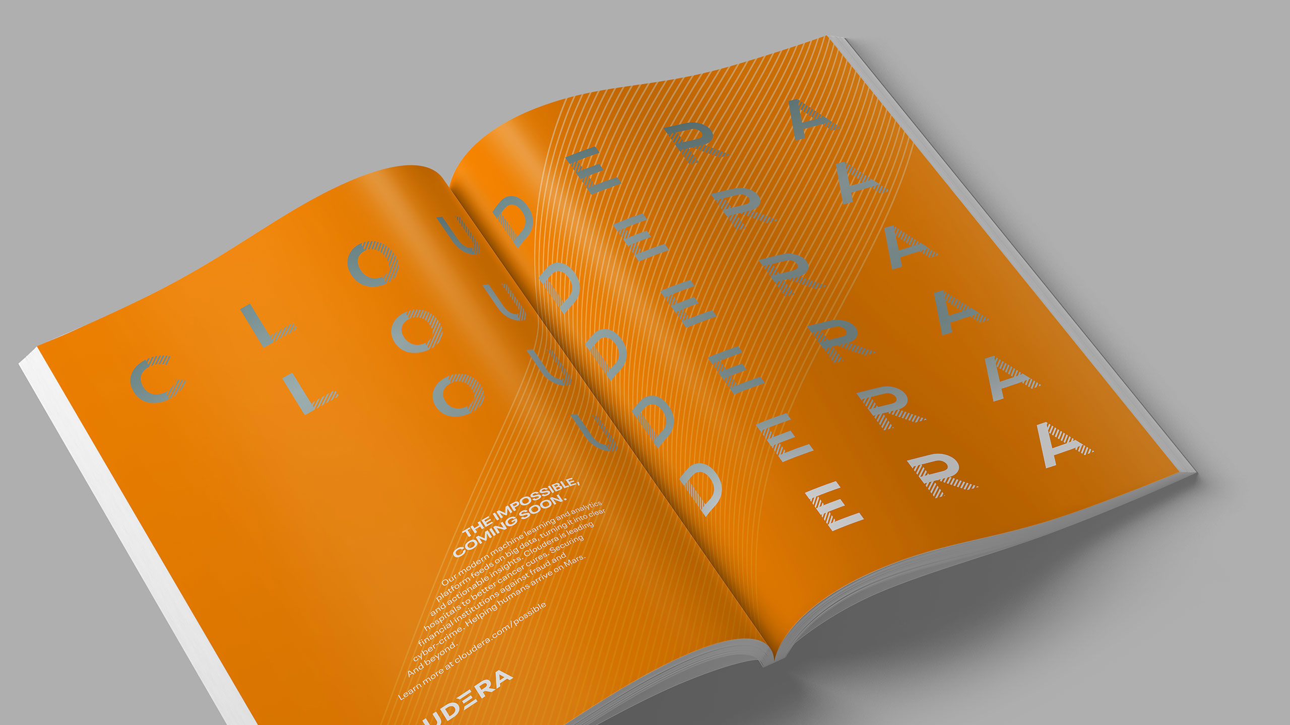
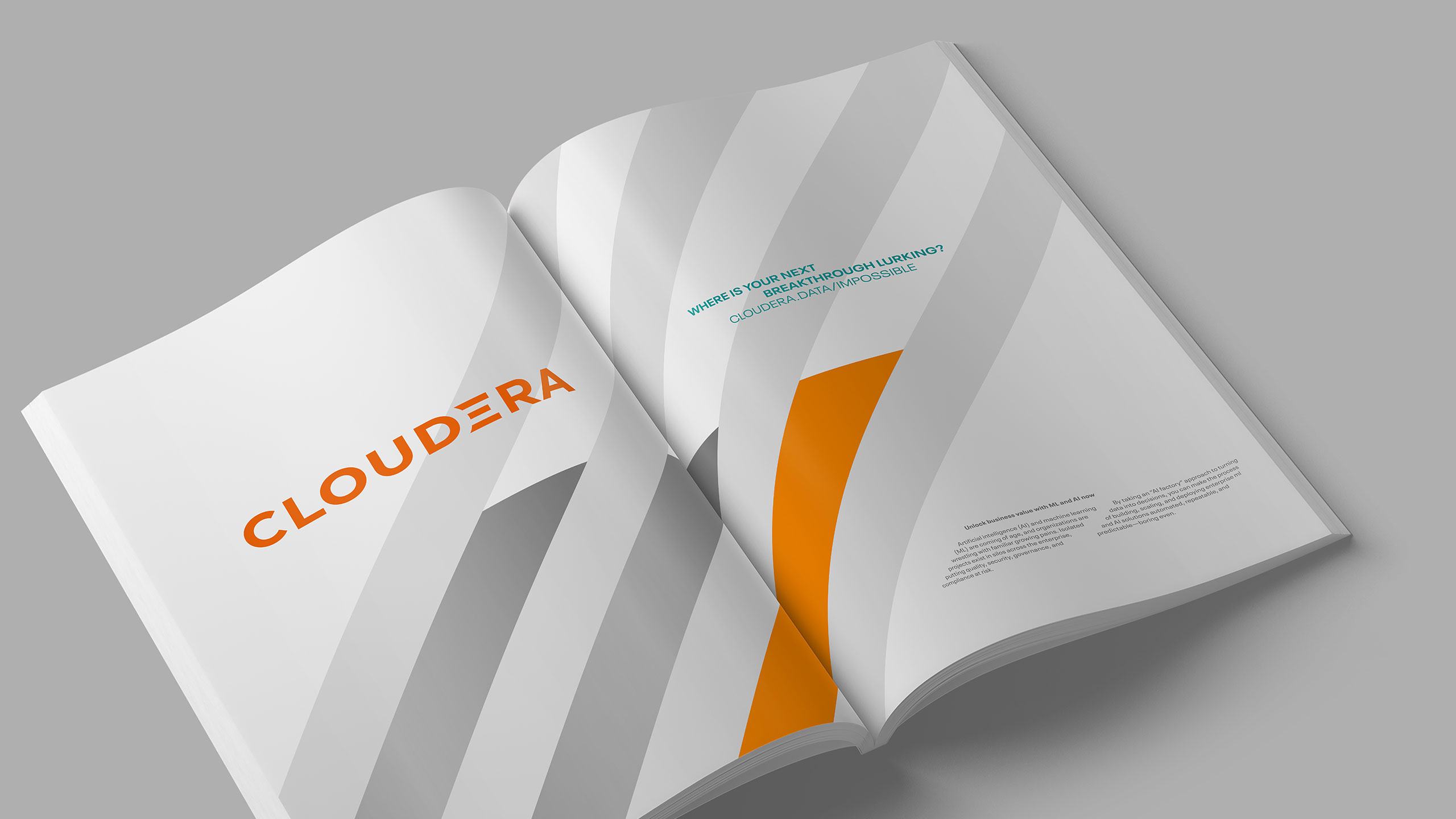
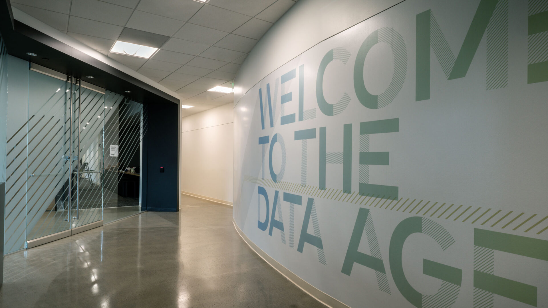
Cloudera’s brand is anchored by a graphic system built from a simple 45˚ line that can be used to build patterns, fields of color, as well as a custom typeface we designed.
Portrait photography by Bryce Duffy.
Voice
Cloudera’s culture has warmth and humanity. We amplified this with a voice that is approachable; taking tech speak and translating it into human speak.